Showing posts with label illumination. Show all posts

Tuesday, May 16, 2017

Vitreous Paint Experiments (Malachite)

I bought a small bag of malachite chips to grind into pigment, to go into the William/Isolde scribal gift box. As I was having fun smashing it, it occurred to me that we do have greenish pigments, and I wondered if malachite might not compose one.

So, I smashed it and smashed it until I got cramping fingers and crossed eyes (Actually, not that long or difficult). I got out my handy 325 mesh sifter, as in theory that's the level Reusche grinds to, and sifted the malachite until I had a handy stash in an old spice bottle.


Because I am for scientific experimentation, I wanted to control everything except one variable. I used some Reusche clear glaze base so I could see what the malachite would do on it's own. I realize, I don't know the ratio of glass (or glass components) to oxides in pigments; One period text would say 2 parts glass to one part copper. I made four test chips to compare different ratios, 1:1 through 1:4.


I mixed them on an ad hoc glass palette with a muller. The muller, being glass, seemed the easiest to clean. I noticed how easily the pigment mixed, much like working with commercial (Reusche, Fusemaster, etc) paints and stains. The very fine mesh size seems to promote fluidity. I used a bit more water than I would for "real" but with this small quantity of paint it was rather difficult to get the right water content (I guess I could have tried to drip it off an eyelash or a cat's whisker, but neither myself nor Zod were willing to cooperate with that). The water won't change the performance of the paint, only how it handles on the brush, so having too much water shouldn't impact the results.


I weighed them on my mini digital scale to get the ratios. Although it does .1g increments, the floor seems to be .2 grams. That was what I used as a "unit", so the 1:1 chip is .2 grams of malachite to .2 grams of clear base. The 1:4 is .2 grams of clear base, and .8 grams of malachite. I wrote my name on the chips, for some reason the first thing that entered my head, to test the line work. I then smeared paint on the bottom block of each chip to show various values. I also marked the ratio at the top.

I then fired the chips on my standard vitreous paint schedule, which matches the range for the clear glaze base. The next morning I was fascinated to see significant change in pigment. What I was aiming for was something akin to "Grey green" pigment, a modern sample of which is here placed next to the chips:


The malachite DEFINITELY darkened. To my eye, it also seems more faintly blue than green. Azurite, a deep blue twin of malachite (both are copper (II) carbonate rocks) will turn into malachite when weathered, but nothing in my research shows the reverse. I did find that azurite when heated turns into copper (II) oxide, a black powder. That oxide is then used as a ceramic pigment, making blue as well as green, black, pink, red, and gray colors. I suspect that's what has come into play here, the malachite likely also forms the oxide which would account for the blueish hint and the darker color. I am not a chemist, however, and I couldn't easily find a reference to what happens when you heat malachite. [Edit: A friend reposted my link to get the attention of some chemistry-buff friends, and one Liz pointed me at this link. Malachite does turn into copper (II) oxide.]


I first picked up the 1:4 chip, and immediately noticed the paint flaking off onto my fingers. My fingertips were tinged grey/black/blue. I found, using a wooden skewer, that the 1:3 chip was also very easy to scratch paint from. The 1:2 I could leave some trace, but not much. The 1:1 completely resisted the stick like Reusche paints would. Looking at the reflected light, the 1:1 chip also looked much like a dozen other test chips I've made; the paint is completely glassy and adhered to the test chip. I fire my vitreous paints to the high end for that effect, so this is expected. The other three showed a rough, grainy texture I associate with previous experiments that had too rough an oxide.


Lessons Learned:

  • Yes, a randomly selected mineral MIGHT make a usable vitreous paint!
  • Something near a 1:1 ratio is probably idea to bind the pigment to the glass, though 1:2 was also serviceable. My tests of the period formulas are 1:2, and were very similar.
  • It would be wonderful to find out what actually goes into Clear Glaze. My normal secret trick is to check the EU vendors, who seem to list MSDS's that US vendors do not. Unfortunately Peli doesn't include one for Clear Glaze. Reusche gives them out if you make a special request in writing, whereas Peli just has them on their website. I rather suspect this is because the MSDS sheets rather give away the secrets. 


Monday, September 15, 2014

ODH Scroll for Baroness Zafirah

I describe myself as the worst scribe in the Midrealm. Frankly, I don't self-identify as a scribe at all. I don't work on any kind of C&I in my free time or for enjoyment. I started taking scroll assignments in my capacity as a herald to assist the scribes when a court list came out on short notice or was larger than normal. I've made 3 or 4 paper scrolls, unhappy with any of them, before deciding that I should try and make a glass scroll and play to a strength while getting the job done.

Still, I never take assignments above the AoA level, I leave those for the practicing scribes. So when Estelle, my good friend and our chief Signet messaged me on Facebook offering a Dragon's Heart assignment I balked. Twice. She was insistent, I'd really want this one. I finally agreed and was not disappointed. But that left me needing to figure out how to make a scroll worthy of our highest service award beneath a peerage, one going to another dear friend.

I started sketching ideas on my train ride and sent her a picture. She immediately liked one of the designs so I worked on making it into a full cartoon.

It can save a lot of frustration to make the most difficult cuts first, so I started on the heart. Slowly removed the "dip" in tiny cuts until I didn't dare press my luck further:


I painted on the lines with some fear. I've made one other Dragon's Heart (a suncatcher, not a scroll) and the green glass turned from a translucent Hunter's green to an opaque green with translucent mottled spots. I had one sheet of glass and it pretty much had to work for me to be done on time.


A sheet of lined paper from my previous scroll was sitting behind the lightbox, and it came in very handy with this. Once dry I did some stickwork to clean up the lines, and fired it overnight. I was intensely relieved when the glass came out looking as it had going in.

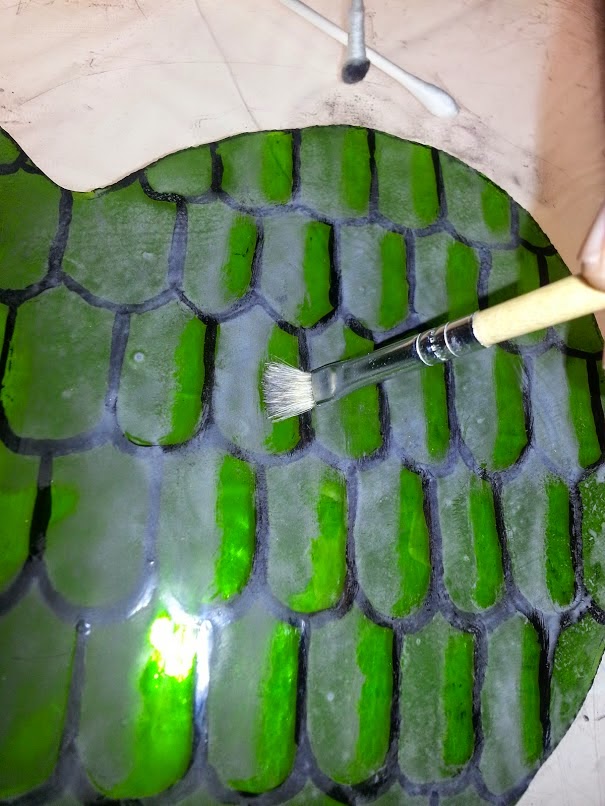
I was going to leave it alone there, as with the other heart, but I wanted to make it stand out more and thought of shading/highlighting schemes. I hastily mixed some paint, applied a mat, and tried several schemes for highlighting either the entire piece or the individual scales.


The left half is shading the entire heart (though not as gradually as I planned). The right half shows a stippled highlight, scrubbed highlight, a stickwork edge, and combinations.

I then decided this mat was a LOT heavier than I desired and redid it with something more like what I wanted in the "real" shading. My consulting scribe said she thought the scrubbed scale-by-scale highlight looked best so I did more of that on the test piece.


That being settled, I ground and remixed my paint better, and did the real thing. An observation about scrubbing is below.


The red and clear fill-in for the "inner circle" was easy and routine. I found a Spectrum Baroque sheet that had faint tan streaks and chose it for the calligraphy border for interest, rather than use more of the Foxtail sheet from the inner circle. This time I mixed up some water-based paint, after speaking with Kirsten about it, rather than the clove oil paint before. I tried the dip pen, but it fought me again. I finally tried a tiny brush from the local hobby shop, intended for painting Warhammer miniatures. I discovered that a pretty good technique could be gotten from it. A painting bridge was extremely important to this work. The calligraphy isn't great, but this time I've come away believing that with a bit of practice I could make some respectable lettering. The water-based paint made half the difference as well.

As always, click to see larger versions.


I was very unhappy with the way it looked foiled. The gaps were rather large. I suspect it's because I use photoshop to make my own patterns at times, and the lines are fuzzy. I think I'm sabotaging certain custom patterns right from the start by not having crisp cutting lines. I eventually quit trying to evenly space the pieces, and instead I pulled them closer to the center. This caused heavier lines and larger gaps between the heart and the calligraphy border, but at that point it looked symmetrical and pleasing to the eye, at least I felt so.

As the woman who taught me stained glass once remarked, "black [patina] hides all manner of sins" and once the roundel was completed I was much less upset with the finished product.


Lessons Learned
1) Water based paint
    After I made the Acorn scroll Kirsten mentioned she does her calligraphy with water-based paint for easier clean-up. I often remark that glass is a forgiving art for a shaky non-artist like myself because we can clean our lines up a fair bit. I don't have a before picture of the calligraphy for a reason, scribes would faint. I intend to use water-based paint to "calligle" going forward. I'm next going to try it with a "kistka" tool used in pysanky painting, another Kirsten recommendation.

2) Mixing from the edge.
    It's very difficult to keep a pallete of paint well-mixed with a tiny brush while writing. I found if I started aiming for the edge of the puddle it was easier. In this picture you can see the paint separating (It is my understanding the "grey" water is the gum arabic separating out). You'll notice the edges remain black. I started quickly mixing that small area when loading my brush. I can't be sure if this actually means I got very little gum into my paint, but I had no problems getting it to hold the glass until firing. 


3) Scrubbing
     I think I've remarked before that I love the look a hog bristle scrubber leaves on paint. There can be tiny lines left behind that look rather like a carved blockprint. It's an imperfection that is beautiful to me, and there are very few of those in this world. I started off using Q-tips to scrub out paint but that got messy. I switched to a bristle brush and enjoyed the look much better. The line between shading and highlighting is not as crisp and sharp but looks less amateurish to me. Unfortunately to get that effect I was very hard on the brushes, bending the bristles at the ferrule in a way you would never do a loved paintbrush.


4) Matting
     Paint does lighten-up by 20-25% after firing. The lighter matting paint I put down disappears in strong light. I took some pictures in my window, but direct light on a clear sunny day made the shading disappear totally. A cloudy day should show it as I intended, being similar to my lightbox. A darker mat (though not as dark as my first practice!) may have been better.


Thursday, May 29, 2014

A Stained Glass Scroll

I've seen a few stained glass award scrolls in recent years. Each one has been for a peerage. A recent court list came out shortly before the event and, feeling it my duty, I offered to take an assignment to help out. While thinking about the scroll design I wondered why I, the self-declared "Worst Scribe in the Midrealm" don't ever try and play to my strengths. There is no reason why a stained glass scroll could not be for a lower award, and my assignment was for an Award of the Silver Acorn (Midrealm Youth A&S award). A bit of inspiration struck me. Later, a new bit of inspiration struck me.

I manually cut out an 8" circle of clear glass. Using the knowledge Lady Moll had given me last Pennsic, I prepared a heavy matt and applied it to most of the disk. I blended it as even as I could and let it dry.

Once it dried, I laid it directly on my cartoon. Normally my patterns go beneath a thing sheet of plexiglass on my lightbox, however I've learned that even a little distance weakens the image. Placing the glass directly on the paper gives me as clear an image as possible through the matting. I grabbed a stick (specifically a bamboo skewer, I buy them 100 at a time at Walmart) and traced the outline of the white spaces.


When I mixed my matting paint I intentionally went heavy on the gum arabic. I knew I would be handling this a lot and wanted the paint to have solid grip. Unfortunately I then discovered my scrubs couldn't remove the paint. I had to spent between 90 minutes and 2 hours with my skewer in hand, scraping out the spaces. OUCH.


Once I was happy with the white space, I fired it. Fortunately it fired well! Everything looked good, so I began the part that I feared the most: the calligraphy.

I will reiterate, I am not much of a scribe. I can bumble my way through some Carolingian Miniscule or the old gothic hand they taught us in middle school art class. It's not polished and I don't use a dip pen or period inks. I only take assignments when it's an emergency (large lists/short time, etc). I don't TRY and put my terrible handwriting out into this world. Does this seem like a lot of dithering? It is, and I hope to some day be remembered for my glass work, not my scribal arts. Please forgive the atrocity you are about to witness.

Parents, cover your children's eyes. Children, get a parent who will cover your eyes.


At least Their Majesties can rest easy I won't make a profession out of forging their signatures! I suspect Estelle will tell me it's not that bad, etc etc. 

Now, for the calligraphy. I've tried in the past preparing standard water-based tracing paint and a square-shaped brush. I couldn't get anything resembling a good result. I consulted Elskus, as I often do when stumped. Around page 65 of my edition he describes sketching on glass with metal pens. I realized that I should be able to repurpose this method for calligraphy. My scribal betters may be momentarily pleased, for once I grabbed my metal-nibbed dip pen!

I put a small pile of black vitreous paint on my palette and added just enough clove oil to grind and start working the paint into a paste. Once it was well incorporated I added more clove oil until it got near the consistency of black india ink. Elskus is very clear that it must be slightly thicker than *black* india ink. Fortunately at the bottom of my scribal box I had a vial of it for reference. 

Once the clove oil ink was ready I put it into a narrow container (a plastic sake cup, specifically) into which I could dip my pen. I had a piece of paper with lines on it to place under the glass as a guide. I then went to it.

Clove oil does not spread, and is considered a "non-drying" oil. It will dry when heated, however. 

Once the second firing was finished, I applied a much lighter matt with the same paint for shading. For accents I decided to apply some silver stain to the little circles. One last firing and it is complete.


The seal was created in polymer clay by our Dragon Signet. It is intended to be hung from a hole in the scroll, however I opted to use two small soldered jump rings. My original plan was to drill the holes in the glass first, to ensure it would be safe. I forgot and jumped straight into the painting, and didn't want to risk breaking the glass at this point. I drilled one hole for the hanging jump ring. I worked some chain into it and soldered it closed.


Lessons Learned

It is essential to get the paint ground as well as possible. My palettes aren't rough enough and I didn't spend enough time grinding the paint. This lent a certain grittiness to it that made it occasionally difficult to write with. It's hard to get rough palettes without sandblasting gear, however. Hopefully I'll have that remedied before Pennsic.

I had issues with my dip pen and the little reservoir clip. Near the end I just popped it off and dipped more frequently.

Most everyone who saw it asked me why I had the "paint smear" the "smudges" or in one rare case "the shading." The 3D effect was not immediately obvious to anyone who saw the scroll. I will need to keep that in mind in the future. This was my cartoon:


You must learn to love clove oil (or aniseed oil, an alternative Elskus mentions), because you will smell it for hours, days, etc. Over this past weekend Mistress Kirsten said water-based paint will work just fine for this purpose, which would be MUCH easier to clean and correct, though at this point I might miss the clove smell!

Use a guide for scratching out the circles, they will look much smoother!

Jump rings get hot INCREDIBLY Fast. I have a ring-shaped burn on my left index finger after barely touching the ring with the soldering iron. I wonder if they are plated copper?

It was nerve wracking to take the scroll back, after the recipient and seen and held it, and tear it apart. I was afraid the stain would go wrong, the glass shatter, the drill crack it, etc etc etc. I only had a few days to make this happen, in the future I want to make sure it is completely done before it is turned in before court. The stress is not good!

Sunday, March 9, 2014

Making a hogs-bristle brush

I had some trouble when I tried making my first minever paint brush.

I researched it a bit more and discovered two things: The first set of quills I had purchased were mutants and had been cut short by the vendor and second, people working with quills usually soak them to make them softer.

Now, to be clear, in the directions on p. 40 of my copy of Cennini he doesn't say to soak the quills. His thread may have been stronger, his quills thinner-walled, or many other things. However it looks like fly-fishers and others using these quills today frequently soak them, so I gave that a try. That made the quills softer and suddenly able to take a bit of a "squeeze" that broke my thread with the first try. Not wanting to waste my precious supplies of stoat tails, I decided to try again using hogs-bristle (the other type of brush described by Cennini).


A feather from the first set (top) next to one from the second set. I hadn't realized the feather should have this chiseled tip the top one has. Comparatively the second set also have much more usable quill.

The process is pretty much exactly as described in the previous post. I have a pack of hog-bristle brushes that I bought for scrubs in my glass painting. I took an exceptionally large one for which I had a duplicate and took it apart to claim the bristles.

An interesting observation, the bristles have a "root" end. I'm not sure it's biolgically/cosmetically a "root" but one end will be thicker and stronger on a good bristle (I also don't know why these are bristles and not hairs, but I'm a glazier-turned-brushmaker not a biologist... yet). I found it important to try and line up the bristles so I knew which end was the thicker/stronger end.

I took my soaked quill and trimmed the very end off. I used a tapered stick "of other good wood" as Cennini calls for, and shoved the quill on as far as possible. I then grabbed a clump of bristles and shoved them in the other end. Cennini described sticking bristles/hairs in individually until you can't get any more of them. This is where it became a LOT easier to know which was the strong end, as that end wiggles in more easily.

This also makes some sense for retention purposes, I think. The portion of the bristles that is at the opening of the quill is somewhat thinner. You can sneak more bristles in. If you were to try and pull the bristles collectively, however, I think the thicker ends would jam and not come out in a clump.

I tied a knot with my waxed silk thread and could see the quill took the pressure a little better. My thread snapped, after I had gotten the knot tied. On a lark, taking a note from an old martial arts movie that "wet silk never breaks" (not true!) I soaked the thread. I continued tying another knot and doing a little wrapping (that was probably too loose). Its difficult to do all this with only two hands! Same thread, knot, wrapping on the other end to secure it to the stick.


The brush was a little wild, and as Cennini told me to, I trimmed it down a bit:


As a final step I dunked it back into water and made some practice strokes. I gently tried pulling the bristles and none came out. I wouldn't give them a serious tug, but I think this is a practical brush made exactly to the primary source's standards. We will see if it holds up to vitreous paint and silver stain, however!

When I teach my silver stain glass this Pennsic, I hope to give out small vials of stain. I'd love to make a dozen of these to give out too. It didn't take too long in the scheme of things and would be a nice touch!

Lessons Learned:

Hog bristles are much more clingy than stoat fur. When I dunked my bunches of bristles in water they immediately made a tight cluster. I had to work the fur with my fingers for a while to try and make a cohesive bundle. I think in general bristle brushes are going to be easier to make than stoat.

I'm not sure why soaking a hard protein-based quill makes it softer, but don't our fingernails do the same after a hot soak in the tub? Might be something to investigate when bored later.

I have typed and said Cennini's name so much lately I'm starting to feel bad that I have no idea how to pronounce it. Keh-nee-nee? Cheh-nee-nee? I highly doubt it's Sen-nee-nee. I'll need to figure that out before I teach and have to say it several times.

Friday, February 14, 2014

An Observation on Backgrounds

A quick interesting comparison. There's good documentation that stained glass art in the middle ages was influenced directly by other art forms. I noticed this today while reading a book on the Crusades.

Look at this 14th century panel from the Cathedral of Strasbourg in Alsace (France):


And check these slightly earlier illuminations:


And further windows from the cathedral: