Showing posts with label A&S 50 Challenge. Show all posts

Sunday, April 24, 2016

Four Rivenstar Badges

A bit of a secret project! Malie bean MhicAoidh commissioned four suncatchers of the Rivenstar badge. Two for Moonwulf and Takaya, retiring as Baron and Baroness Rivenstar after 40 years (!!) of service, and two for their successors, then-unnamed.


Irony being what it is, Malie and Adhamh were selected. They still wanted their two, however!

The first two were made out of a dark cobalt blue glass. Very pretty. Unfortunately I didn't have enough for all four from that glass, and realized it after the first was done. I checked with Malie and she was ok with them being in sets of two. The other set (pictured above, being held by her then-almost Excellency) are made from Spectrum Dark Blue cathedral. The clear on all four is a seedy Kokomo. I have a thing for seedy glass! All four are wrapped with 1/8" zinc u-channel came and have ~1' chains.


They seemed pleased with the suncatchers, and I'm quite glad for it.

Lessons Learned:

Black Patina for Zinc does actually work... As in the past, I was getting fairly irritating results, weak and blotchy. I read the directions (...) and realized it implies you should apply it fairly heavily. It also says to leave it at least 15 seconds. Being patient with it, the patina does eventually work fairly well.

The two diagonal points, 8 and 11 in the picture above, are tricky because of the flanged base I put on them. Initially I tried cutting them out as "S-curves" and at that tiny size, It worked much better to do it as two C-curves.

Man, Zinc... there's gotta be a better way. The problem is the initial soldering to join the ends. The best solution I could find was to squeeze the ends tight from a few inches to the side, and press the piece against the wood edge of my soldering board, freeing one hand to pick up my soldering iron, grab a daub of solder, and seal it. Then I held it until the solder was colder than a Pennsic shower to be sure it wouldn't spring apart on me. That happened...

And cutting it! I usually use my lead dykes on it, but it deforms the end terribly. Makes it hard to get a clean joint on the other end of the circle. This time I cut the "leaves" individually, and then flexed it to snap the heart via metal fatigue. That gave me a much cleaner end to work with.

Chain. Always buy more than you think you'll need. And mounting them on a 180-degree arc (straight horizontal line) was not a fantastic idea, as the suncatcher wants to tip a bit. 


Friday, April 1, 2016

The Arms of Baroness Laurencia of Carlisle, OL

Hello! It is a few minutes before midnight on the eve of Laurencia's elevation to the Order of the Laurel. I am scheduling this to go live early in the morning; I'll post it to Facebook mid-morning when it should be safe! Let me apologize in advance for the inevitable spelling and title screw-ups! Also please note you can click on pictures to enlarge most of them. -Brynn


I used to work with Laurencia and her husband, Eirikr inn havi four or so years ago. A few months ago he messaged me on Facebook to ask if I could do her device for her upcoming elevation.


The original image he provided


Knowing her elevation was to be at Ice Dragon in April, I sat it on it for bit. Too long, but ok in the end! I seem to recall being told Laurencia is part of the "14th century mafia" so I wanted to pick a design that was appropriate to her period. Looking at extant panels from France and England, I found several of an armiger's device set in "plain glazing" or a window of clear glass. Frequently we do quarries with more acutely angled points, diamonds like the suit on playing cards.


Like these! Image courtesy of the CVMA


In several windows of this time, however, I saw they were the 90-degree style diamonds. The more acute style seems much more prevalent in late-period windows, I'd like to dig into those changes sometime.

At one point I thought about setting her device in a ring of laurel leaves, but I found it very difficult to do so within a reasonably-sized window. I tried scaling my pattern up from 12 to 14 to 16 inches square, but I couldn't find proportions that were acceptable. Either the ring was too thin, or the device too small, or the combination awkwardly placed in the pattern. I eventually dropped that plan and just focused on her device.

I opted to used all mouthblown ("Handmade") glass for this. On hand I had sheets of Krosno (from Poland) and St. Just (from France). I had never mixed them, so this was the first opportunity I had to note the difference in their compositions:


The edge-on view gives it away. The green is caused by iron impurities, though a few sources claim some copper content can do that as well. Ensuring the iron is kept out, or adding selenium or lead, causes a clearer glass as with the other brand here. If I'm not mistaken, it's the St Just that is green.

The flashed glass I used, red flashed on clear, is of unknown provenance via THL Molly Sotherden, but despite hearing of it's existence I've yet to find machine-rolled flashed glass. Looking at the irregularities, I feel very confident it is mouthblown as well. I learned during this project that flashed glass can be a striking color (See Lessons Learned section below). Flashed glass has a thicker base layer of one color (usually clear) and a thinner layer of another. It is one solid sheet of glass with two distinct sides. Originally this was done because otherwise some colors were too dark to transmit light (red is the best example). A sheet made in the typical way would appear black. Giving a thin layer of color to a clear sheet allowed the red to shine through and remain strong enough to use. In the 14th century it became well-known that you could remove the colored layer and add extra detail without adding leadlines.

At this point in time, most glass cutting is done with a dividing iron (a red hot poker used to incite thermal shock in the glass to give it a crude shape), which can be seen in my post here and the video to which it links. The shape would be refined through a grozing iron (I now use a proper grozing iron made for me by THL Kendrick Cameron, but my original one can be seen here). About this period in time, diamond-tipped cutting tools are becoming known in Italy. I own an antique diamond-tipped cutter and used it a little for this project; unfortunately it is rather temperamental and I wasted half a sheet of clear glass trying to make it work. As a result the majority of the cuts use a modern carbide-wheel cutter to save glass/money.


My modern cutter, and my antique diamond-tipped cutter

Period sources talk of either abrading away the flashed side, or using acid to etch it away. The acid called for in period is generally not strong enough to etch glass unless it is of very poor quality (and hat tip to my Laurel, Mistress Kirsten Thorsteinsdottir, for that fact). Modernly we can use a stronger acid, power tools, hand abrading, or sandblasting. Sandblasting and acid end up with very similar results. Having tried all of these options in the past, and wanting a certain "hand abraded" look on "power tool" time tables, I abraded it using an engraving tool. It is less drastic than a dremel, and after firing I think it looks excellent.


The water bath is probably not period, but we prefer to avoid death by silicosis today! The picture on right is the piece before fire polishing.

I applied vitreous paint to the bird using a miniver brush, as called for in our primary source texts. Period formulas for vitreous paint call for crushed glass and mineral/metal oxides for color. Modern texts reference using glass fluxes and components, rather than actual glass, for making paint, however the oxides are still in use. I fired the three pieces, bird and two halves of the ermine section, in my modern electric kiln. My tests on proper period kilns are still forthcoming and, again, the glass is expensive to waste!


The central/bottom portion, after firing


The entire device, fired. I aligned the ermine spots to coincide with the lead line to try and mask it a little. Fully period cutting tools might have been able to get that steep inner angle cut out of one piece of glass. Might.

I cut the background of quarries and got stuck worrying about the next steps. Obviously lead came would be the period technique, and cast cames at that. I would have to use purchased milled cames, but my skillset with came is very rusty, and it's not as strong. In order to have a strong, lower-maintenance, and better looking end product I opted to use modern copper foil methods to assemble the window. That would be the biggest concession to modernity but I feel it was/is the right call.


The glass, all cut.


The glass, all foiled!


A pretty close-up 


The completed and framed panel

I put the completed panel in a wooden frame, which is called for in our primary sources. I added modern hanging hardware (eyelets and rustic copper chain) for Laurencia and Eirik's convenience. I hope that it arrived unbroken and that it is only one of many beautiful things she gets on the day of her elevation!


Lessons Learned


1) Diamond-tipped cutters are finicky!

2) From a discussion with Conor O'Ceallaigh, after fire polishing some non-yellowing lacquer could smooth out the texture further. I had several kinds on hand, but I wanted the abraded texture to remain.

3) I need more practice with framing stock. These pieces fit fine when I cut and test fit them, and held while I handled them after gluing. When I added the support brackets on the back, the joints popped a bit and gaps appear. OI!

4) This is only the second time I had an issue with a glass color striking on me, and the first was understandable as it was a green enamel. My sheet of red flashed was in two pieces; I knew one end was a prettier red and the other end was an odd brownish-purple color. I couldn't find the larger sheet with the better end, only a significant piece from the brownish-purple side. Remembering a funny story involving this piece two years ago (which I only told on Facebook, I'll add it here later today), I checked it against two different light sources. Sure enough, backlit by an incandescent bulb, it was beautiful ruby. Against fluorescent or sunlight, purple-brown.

Color being what it is between devices and cameras, this is the best I could do.

Since yellow light turns it ruby, I thought I could hit it with some silver stain to bring yellow into the mix, and have a piece that was actually red. I fired a test chip and when I pulled it out of the kiln, I was shocked to discover I couldn't see where the stain was. I was a bit disheartened and considered plans B (enamel) and C (piecing it together). Then I realized I couldn't tell where the stain was on my test chip because the entire piece had turned ruby.

This is actually the unfired piece from the picture above lit by a different lightbulb, but this is how the finished piece looks in all light as you can see in all the other pictures.

That was fascinating and a surprise!

Sunday, March 27, 2016

Archery Prize: Pheons

Details to come shortly! An educational lesson with Molly that churned out the first of a few archery prizes:


Monday, January 11, 2016

Two Ayreton Stars

The lightbox, at the moment

The muse sang so I danced. I've cut two Ayreton Populace Badges to whip out in a hurry and give to the new TE Ayreton. They aren't actually done, but I think the lessons portion is done, and there are a few lessons learned! I'm writing this up early and will follow-up with a completed picture in a day or two.

I was originally going to do one "swirl" and one "straight" but cut them both swirled, and I have no regrets. As soon as I finished cutting the first I thought those straight lines would be SO BORING and amateurish (not that anything with 12 pieces is particularly fancy!) unless I found the perfect bevels.

I cut the pieces for the first one out (the one laid out, top right corner), and set them on the pattern. And then I freaked out. They weren't fitting. AT ALL. Not even close. For a change of pace, and a bit of experiment, I decided to do these by cutting out the pattern with shears and tracing them onto the glass. How could it be that wrong?! I had a mini-meltdown via PM to Roana. THIS IS NOT WHAT I NEEDED when I am trying to rebuild a basic amount of confidence in my ability to make glass art.

After a few minutes of panicked thinking, I had an idea. It's a round pattern, right? When I began cutting it with shears, the first thing I did was cut out the circle. Maaaybe I had just rotated it in relation to the reference (unsheared) pattern. After frantic comparison, I discover it's off 30°. "4" is actually "5', and so on. WHEEEW.

So, I had to recut a blue and a green piece, since rotating them offset them by one of each color. I knocked those pieces out. Then I realized I could have just rotated my reference pattern to match the cut up one. At least I was able to laugh...

With this second one, I plan to use etching acid either in the center of the star, and drybrush it out toward the tips, or at the tips and drybrush it toward the center. If I can make it match what's in my head, it will be beautiful.

[Edit later this week with completed pictures]

The first one, completed:


Sunday, October 26, 2014

Purple Fret Scroll for Lady Kat the Green

A few shots from a quick scroll for Lady Kat the Green of House Dark Horse. She received a Purple Fret last weekend at Fall Crown.

Not happy with the soldering. I've been spending some time doing drills of the basics (cutting, soldering), so focus on them. I think at times I get sloppy and need to slow down, focus, and don't forget the basics when I'm thinking about flashed glasses and silver stains and so on!

Calligraphy done by THL Justice McArtain, who was trying calligraphy on glass for the first time. He had positive things to say about it and has agreed to write another scroll I have in mind.

This is also my first pattern made using Pattern Wizard. Photoshop always gives me fuzzy lines which I'm realizing hurts the accuracy of my cutting, no matter how well I think I can "see" the line anyway. I also keep doing these on short notice... all of the soldering for this scroll was done in a few hours at night after site setup and immediately before going to bed (with "sleep" the reward for finishing it... that doesn't encourage careful work, and I need to stop doing it!)


I was initially unhappy to use "gold" glass but I didn't have enough of my "lemon yellow" sheet left. I used it for the last purple fret suncatcher I made as largesse. In hindsight I think this looks infinitely better than the lemon yellow, and I love that texture (believe this is spectrum waterglass).

At the urging of friends I won't sit and do a critique of my work and the spots where I'm unhappy with the rushed and in-the-dark soldering. If you don't see them, thank you :). If you do, know that I do too :)

I also learned that this reign Their Majesties Cadogan and AnnMarie "escrowed" a copy of their signatures with the Dragon Signet for those making alternative scrolls. I think this is AWESOME. I didn't directly trace the signatures because even enlarged they appeared to have been written with the World's Smallest Calligraphy Nib so I tried to paint them in a similar hand. Seriously, if I couldn't see the varying line widths I'd swear it was a ballpoint pen, I want to see the nib used!

Lessons Learned
Don't solder or generally work on a 48-hour deadline, dang it.
Have GOOD lighting while soldering. Don't solder while your crash space-ees are trying to sleep.

Monday, September 15, 2014

ODH Scroll for Baroness Zafirah

I describe myself as the worst scribe in the Midrealm. Frankly, I don't self-identify as a scribe at all. I don't work on any kind of C&I in my free time or for enjoyment. I started taking scroll assignments in my capacity as a herald to assist the scribes when a court list came out on short notice or was larger than normal. I've made 3 or 4 paper scrolls, unhappy with any of them, before deciding that I should try and make a glass scroll and play to a strength while getting the job done.

Still, I never take assignments above the AoA level, I leave those for the practicing scribes. So when Estelle, my good friend and our chief Signet messaged me on Facebook offering a Dragon's Heart assignment I balked. Twice. She was insistent, I'd really want this one. I finally agreed and was not disappointed. But that left me needing to figure out how to make a scroll worthy of our highest service award beneath a peerage, one going to another dear friend.

I started sketching ideas on my train ride and sent her a picture. She immediately liked one of the designs so I worked on making it into a full cartoon.

It can save a lot of frustration to make the most difficult cuts first, so I started on the heart. Slowly removed the "dip" in tiny cuts until I didn't dare press my luck further:


I painted on the lines with some fear. I've made one other Dragon's Heart (a suncatcher, not a scroll) and the green glass turned from a translucent Hunter's green to an opaque green with translucent mottled spots. I had one sheet of glass and it pretty much had to work for me to be done on time.


A sheet of lined paper from my previous scroll was sitting behind the lightbox, and it came in very handy with this. Once dry I did some stickwork to clean up the lines, and fired it overnight. I was intensely relieved when the glass came out looking as it had going in.

I was going to leave it alone there, as with the other heart, but I wanted to make it stand out more and thought of shading/highlighting schemes. I hastily mixed some paint, applied a mat, and tried several schemes for highlighting either the entire piece or the individual scales.


The left half is shading the entire heart (though not as gradually as I planned). The right half shows a stippled highlight, scrubbed highlight, a stickwork edge, and combinations.

I then decided this mat was a LOT heavier than I desired and redid it with something more like what I wanted in the "real" shading. My consulting scribe said she thought the scrubbed scale-by-scale highlight looked best so I did more of that on the test piece.


That being settled, I ground and remixed my paint better, and did the real thing. An observation about scrubbing is below.


The red and clear fill-in for the "inner circle" was easy and routine. I found a Spectrum Baroque sheet that had faint tan streaks and chose it for the calligraphy border for interest, rather than use more of the Foxtail sheet from the inner circle. This time I mixed up some water-based paint, after speaking with Kirsten about it, rather than the clove oil paint before. I tried the dip pen, but it fought me again. I finally tried a tiny brush from the local hobby shop, intended for painting Warhammer miniatures. I discovered that a pretty good technique could be gotten from it. A painting bridge was extremely important to this work. The calligraphy isn't great, but this time I've come away believing that with a bit of practice I could make some respectable lettering. The water-based paint made half the difference as well.

As always, click to see larger versions.


I was very unhappy with the way it looked foiled. The gaps were rather large. I suspect it's because I use photoshop to make my own patterns at times, and the lines are fuzzy. I think I'm sabotaging certain custom patterns right from the start by not having crisp cutting lines. I eventually quit trying to evenly space the pieces, and instead I pulled them closer to the center. This caused heavier lines and larger gaps between the heart and the calligraphy border, but at that point it looked symmetrical and pleasing to the eye, at least I felt so.

As the woman who taught me stained glass once remarked, "black [patina] hides all manner of sins" and once the roundel was completed I was much less upset with the finished product.


Lessons Learned
1) Water based paint
    After I made the Acorn scroll Kirsten mentioned she does her calligraphy with water-based paint for easier clean-up. I often remark that glass is a forgiving art for a shaky non-artist like myself because we can clean our lines up a fair bit. I don't have a before picture of the calligraphy for a reason, scribes would faint. I intend to use water-based paint to "calligle" going forward. I'm next going to try it with a "kistka" tool used in pysanky painting, another Kirsten recommendation.

2) Mixing from the edge.
    It's very difficult to keep a pallete of paint well-mixed with a tiny brush while writing. I found if I started aiming for the edge of the puddle it was easier. In this picture you can see the paint separating (It is my understanding the "grey" water is the gum arabic separating out). You'll notice the edges remain black. I started quickly mixing that small area when loading my brush. I can't be sure if this actually means I got very little gum into my paint, but I had no problems getting it to hold the glass until firing. 


3) Scrubbing
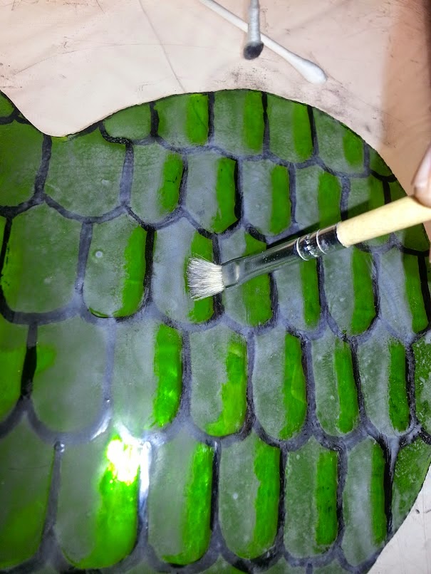
     I think I've remarked before that I love the look a hog bristle scrubber leaves on paint. There can be tiny lines left behind that look rather like a carved blockprint. It's an imperfection that is beautiful to me, and there are very few of those in this world. I started off using Q-tips to scrub out paint but that got messy. I switched to a bristle brush and enjoyed the look much better. The line between shading and highlighting is not as crisp and sharp but looks less amateurish to me. Unfortunately to get that effect I was very hard on the brushes, bending the bristles at the ferrule in a way you would never do a loved paintbrush.


4) Matting
     Paint does lighten-up by 20-25% after firing. The lighter matting paint I put down disappears in strong light. I took some pictures in my window, but direct light on a clear sunny day made the shading disappear totally. A cloudy day should show it as I intended, being similar to my lightbox. A darker mat (though not as dark as my first practice!) may have been better.


Tuesday, August 26, 2014

Texture...texture... the word even feels funny

I am a heavily color-focused person.

I love cathedral glass. It's what I work with 99% of the time. Opalescents lack something to me... it's almost like they are trying to deny their translucent, glassy nature. Don't get me wrong, they are beautiful, and I've spent considerable time drooling over Tiffany-era panels and lamps. But it isn't what inspires me and I rarely feel called to work with those glasses. Though, when I do, Youghiogheny cuts SO well for me. I really CAN appreciate them.

I recently made a small panel for my office, the first time in 8 years I've made a glass object for myself and actually kept it. I was focused, as I often am, on the colors. After staring at it for a few weeks I discovered some beautiful contrasts in the textures that I wish I could tell you were a conscious effort.


This is one vertical quarter of the Flag of the City of Chicago. The blue and red are two colors in the same texture. I'm not sure who makes it, but I intend to find out because it has a beautiful hammered effect in the sunlight.

I had originally chosen a Baroque clear/white glass for the white portions of the flag, because I was focused on the white content without wanting to use a truly opaque glass. I ended up not having enough and switched to a sheet of glue chip I had handy. After staring at it I'm finding that from almost any angle the dense glue chipping has an excellent "white" appearance that I discounted. The contrast between the glue chipping and the "hammered" blue and red gives a beautiful layered effect I hadn't intentionally designed into the panel.

I am trying to take this as a lesson for my modern work, to start giving texture the attention it is due, and not just the colors.

Quick Update (Post-Pennsic)

Had a great time teaching at Pennsic. I'm still trying to clean up class notes before I send them out. I don't want to wait too much longer, however, before something happens and the list of e-mails is destroyed.

Between my own classes and co-teaching with Lady Moll I had seven classes (six glass), and two demo days. It was a busy war!

I've posted an update to my "A&S 50 challenge accepted" post, showing two items that have since been completed and an update to my master page for my A&S 50 challenge listing the projects so far.

I have a couple new books to review, but I will wait until tomorrow after I finish the one.

I'm signed up to teach at Fall Rum and Rendezvous at the Bridge. I'm also hoping to do an A&S 50 display for the first time, at Fall Crown. That's assuming my duties as autocrat let me slip away for 5 minutes to set up my display!


Friday, July 11, 2014

Device of Konstantia Kaloethina

I don't believe I ever posted this here. I take part in the Nobelese Largesse artisan swap meets, coordinated on Facebook. This was the item I created for Konstantia Kaloethina, "Azure, a standing seraph argent, a bordure gyronny argent and sable."


I decided to try enamels, and didn't get it as even as I would have liked (though the subtle texture of the glass may have inhibited this as well). This was better a task for flashed glass, but the swap limits the expense of items that can be used. The border, black and white/silver, is clear and dark smokey-colored glass.

I'm particularly proud of the seraph, because I did it entirely by hand. I didn't trace anything or use a visual reference, I just pulled to mind a seraphim and started scrubbing it out.

Thursday, June 12, 2014

SCA A&S 50 Challenge: Stained Glass Heraldry

1 - The Populace Badge of the Middle Kingdom


2 - Memorial Panel for Bryan (In progress)


 3 - Badge of THL Estelle de la Mer


4 - Cross Pattee (The badge of the Knight's Templar)


 5 - Populace Badge, Barony of White Waters, Lantern


6 - Roundel of the Arms of the Barony of White Waters


7 - Device of Alexander Adelbrecht von Markelingen


8 - House Shadow Dragon suncatcher


 9 - Vickie's device
10 - My device
11 - Ayreton Roundel
12 - Baroness' device
13 - Baroness' husband's device maybe
---
14 - Aggie's device
15 - Eadric's device
16 - Ed's device

 ---
17 - Dayle's device?
18 - Purple Fret suncatcher


19 - Estelle de la Mer Scarab Badge
20 - Dragon's heart
21 - Konrad
22 - Calybrid?
23 - Dougale
24 - N. Oaken Heraldic Display Prize - Tudor Rose Suncatcher
25 - Dr Best
26 - Savage Badge Plates
27 - Device of Konstantia Kaloethina


28 - Silver Acorn Scroll (The award badge is heraldry)
29-  Lilith Northwode

30 - Device of Mistress Elena de Vexin
31 - Device of Mistress Kirsten Thorsteinsdottir
32 - Chicago Star*


33 - ODH Scroll for Zafirah of the White Waters, Baroness White Waters


34 - Master Gailen Alric Ros
35 - Laurel Scroll for Mistress Estelle de la Mer
36 - Badge of Jean-Yves de Chierbourg
37 - Barony of Ayreton Populace Badges

38 - Barony of Shattered Crystal
39 - Archery Pheon Prizes

40 - Badge of Baroness GenRose de Glendalough 
41 - Badge or Device of Quenild of Mercia
42 - Arms of Mistress Gianetta Andreini da Vicenza
43 - Baroness Laurencia of Carlisle, OL
44 - Kendrick Cameron
45 - Petrona!
46 - Kriemhilt
47 - Catarina
48 - Crespine de la Vallee
49 - Purple Fret Scroll for Kat the Green
50 - Midrealm Plates/Bowls

* I rendered a Chicago Star in stained glass for my office. It's purely modern both in subject and construction. Still, it IS stained glass heraldry. I'm including it in the listing unless I reach 50 and have the time to substitute something I feel is more appropriate.