Still, I never take assignments above the AoA level, I leave those for the practicing scribes. So when Estelle, my good friend and our chief Signet messaged me on Facebook offering a Dragon's Heart assignment I balked. Twice. She was insistent, I'd really want this one. I finally agreed and was not disappointed. But that left me needing to figure out how to make a scroll worthy of our highest service award beneath a peerage, one going to another dear friend.
I started sketching ideas on my train ride and sent her a picture. She immediately liked one of the designs so I worked on making it into a full cartoon.
It can save a lot of frustration to make the most difficult cuts first, so I started on the heart. Slowly removed the "dip" in tiny cuts until I didn't dare press my luck further:


I painted on the lines with some fear. I've made one other Dragon's Heart (a suncatcher, not a scroll) and the green glass turned from a translucent Hunter's green to an opaque green with translucent mottled spots. I had one sheet of glass and it pretty much had to work for me to be done on time.
A sheet of lined paper from my previous scroll was sitting behind the lightbox, and it came in very handy with this. Once dry I did some stickwork to clean up the lines, and fired it overnight. I was intensely relieved when the glass came out looking as it had going in.
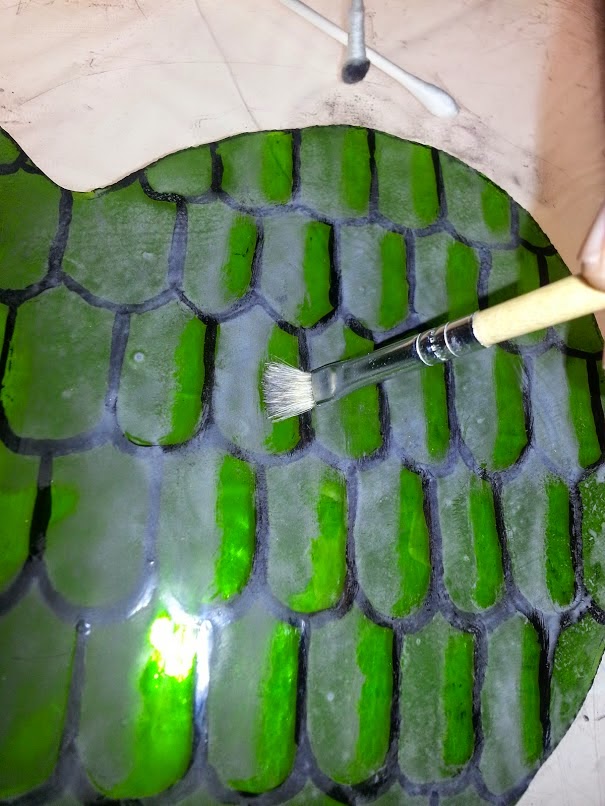
I was going to leave it alone there, as with the other heart, but I wanted to make it stand out more and thought of shading/highlighting schemes. I hastily mixed some paint, applied a mat, and tried several schemes for highlighting either the entire piece or the individual scales.
The left half is shading the entire heart (though not as gradually as I planned). The right half shows a stippled highlight, scrubbed highlight, a stickwork edge, and combinations.
I then decided this mat was a LOT heavier than I desired and redid it with something more like what I wanted in the "real" shading. My consulting scribe said she thought the scrubbed scale-by-scale highlight looked best so I did more of that on the test piece.
That being settled, I ground and remixed my paint better, and did the real thing. An observation about scrubbing is below.
The red and clear fill-in for the "inner circle" was easy and routine. I found a Spectrum Baroque sheet that had faint tan streaks and chose it for the calligraphy border for interest, rather than use more of the Foxtail sheet from the inner circle. This time I mixed up some water-based paint, after speaking with Kirsten about it, rather than the clove oil paint before. I tried the dip pen, but it fought me again. I finally tried a tiny brush from the local hobby shop, intended for painting Warhammer miniatures. I discovered that a pretty good technique could be gotten from it. A painting bridge was extremely important to this work. The calligraphy isn't great, but this time I've come away believing that with a bit of practice I could make some respectable lettering. The water-based paint made half the difference as well.
As always, click to see larger versions.
I was very unhappy with the way it looked foiled. The gaps were rather large. I suspect it's because I use photoshop to make my own patterns at times, and the lines are fuzzy. I think I'm sabotaging certain custom patterns right from the start by not having crisp cutting lines. I eventually quit trying to evenly space the pieces, and instead I pulled them closer to the center. This caused heavier lines and larger gaps between the heart and the calligraphy border, but at that point it looked symmetrical and pleasing to the eye, at least I felt so.
As the woman who taught me stained glass once remarked, "black [patina] hides all manner of sins" and once the roundel was completed I was much less upset with the finished product.
Lessons Learned
1) Water based paint
After I made the Acorn scroll Kirsten mentioned she does her calligraphy with water-based paint for easier clean-up. I often remark that glass is a forgiving art for a shaky non-artist like myself because we can clean our lines up a fair bit. I don't have a before picture of the calligraphy for a reason, scribes would faint. I intend to use water-based paint to "calligle" going forward. I'm next going to try it with a "kistka" tool used in pysanky painting, another Kirsten recommendation.
2) Mixing from the edge.
It's very difficult to keep a pallete of paint well-mixed with a tiny brush while writing. I found if I started aiming for the edge of the puddle it was easier. In this picture you can see the paint separating (It is my understanding the "grey" water is the gum arabic separating out). You'll notice the edges remain black. I started quickly mixing that small area when loading my brush. I can't be sure if this actually means I got very little gum into my paint, but I had no problems getting it to hold the glass until firing.
3) Scrubbing
I think I've remarked before that I love the look a hog bristle scrubber leaves on paint. There can be tiny lines left behind that look rather like a carved blockprint. It's an imperfection that is beautiful to me, and there are very few of those in this world. I started off using Q-tips to scrub out paint but that got messy. I switched to a bristle brush and enjoyed the look much better. The line between shading and highlighting is not as crisp and sharp but looks less amateurish to me. Unfortunately to get that effect I was very hard on the brushes, bending the bristles at the ferrule in a way you would never do a loved paintbrush.
4) Matting
Paint does lighten-up by 20-25% after firing. The lighter matting paint I put down disappears in strong light. I took some pictures in my window, but direct light on a clear sunny day made the shading disappear totally. A cloudy day should show it as I intended, being similar to my lightbox. A darker mat (though not as dark as my first practice!) may have been better.

No comments:
Post a Comment